I have a confession to make to you today: I am a font geek.
Yep, I didn't spell that title wrong. Today's More Than Writers post is all about fonts, not founts, and the wisdom of how, where and when to use them. Apologies if you don't care very much about fonts, but I am a big believer in using the right one at the right time, especially in anything regarding self-publishing and promotion. I also think fonts have a part to play in writing and editing your manuscript in the first place - more on that to come.
This post is more about interior fonts - if you want a post about cover fonts at some point, drop a comment below and I will take note!
Now, when you come to write your manuscript in Microsoft Word or similar, you'll be given the default font (usually Calibri). Fonts like Calibri are good for online typing and reading, because they are sans-serif fonts - they don't have the little decorative strokes, edges and flourishes that serif fonts do. If you look in any paperback book, you'll see that it is a serif font that is used, and that's because it's been proven that when reading on a physical page, readers are more comfortable with a serif font. The nature of these typefaces mean that the eye is more naturally drawn to the next letter, the next word, and so on. When readers are faced with a sans-serif font on a physical page, it can leave them feeling a little disorientated and even dizzy.
You might be thinking to yourself huh, but what does this really matter anyway? Does anyone notice this kind of stuff? Isn't it just nitpicking? Here's what Steve Jobs, the founder of Apple, had to say about the subject when he dropped out of school:
“Because I had dropped out and didn’t have to take the normal classes, I decided to take a calligraphy class to learn how to do this. I learned about serif and sans serif typefaces, about varying the amount of space between different letter combinations, about what makes great typography great. It was beautiful, historical, artistically subtle in a way that science can’t capture, and I found it fascinating.
None of this had even a hope of any practical application in my life. But ten years later, when we were designing the first Macintosh computer, it all came back to me. And we designed it all into the Mac. It was the first computer with beautiful typography.”
The point is that this stuff does matter. The way people process words makes a huge difference to how they view what they are reading. Somebody trying to read Jane Austen in Comic Sans would get very frustrated very quickly, and someone trying to read a comic book in Times New Roman would feel short-changed by the experience. It matters in your interior books (paperbacks - ebooks take on their own fonts provided by KDP or similar, chosen by the reader) - because you want to give a good, professional impression. So here are 9 different interior fonts I use regularly as a book designer and formatter.
1. Garamond
A lot of books use Garamond as their main interior font. It's versatile, restful and flows nicely. My only issue with Garamond is that it can look a little faint against the page, particularly with KDP who don't always print with the darkest ink. You can't really go wrong with it, though.
2. Baskerville
Baskerville is another classic font, often used by professional designers and publishers. It's a little higher and slightly more squashed together in terms of spacing (you can always change that in Word settings, but don't change it too much!)
3. Book Antiqua
I don't see this one used so often these days, but some people like a slightly more chunky font and this fits the bill. It looks pretty good used as an interior font for something like a memoir or biography.
4. Adobe Caslon Pro
I'm a fan of this one. It prints clearly and reads well with a good flow and nice tails on the ys, gs etc. It is a great all-rounder.
5. Century Schoolbook
This is a particularly good font for children's books. It's easy to read for youngsters and flows along the page beautifully. It would look a bit simple in adult books, though. It's best for 5-11 year olds - under fives would be best with a specialist font like Collins Primary or Sassoon Infant.
6. Dante
Dante isn't markedly different to Garamond and Baskerville, but is a nice, gentle font with good tails and spacing. It prints slightly darker on the page than Garamond.
7. Adobe Jensen Pro
If you're looking for something a little more modern-looking, you can't go wrong with Jensen. It's a nice looking font with tidy leaders and tails. It works well in a young adult book.
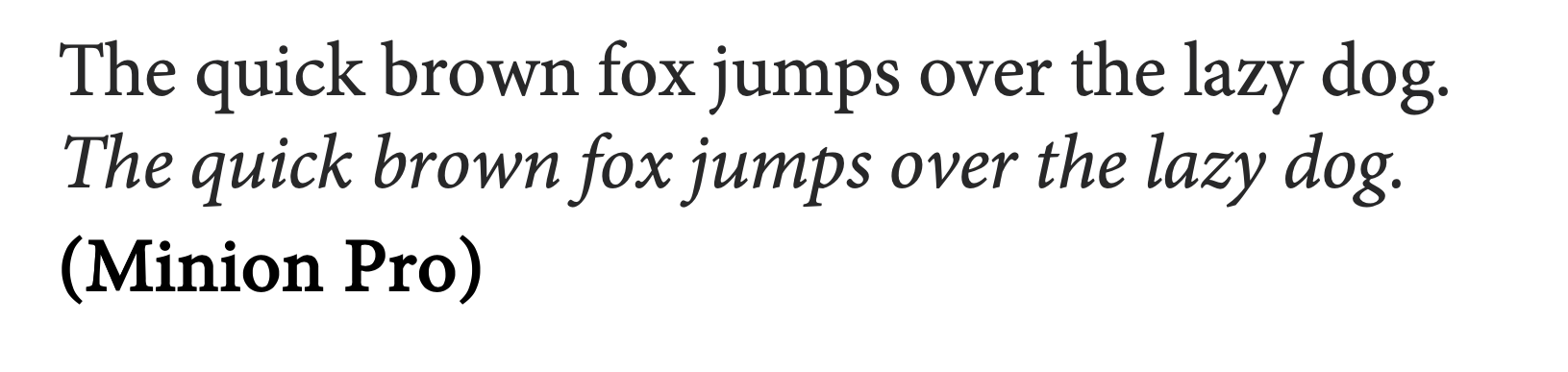
8. Minion Pro
This is my favourite, and the one I use most of all. I think it has everything - a flow, good spacing, good clear printing, nice looking tails and serifs, and it leads the eye well across the page. This font looks particularly good with poetry but works with every genre.
8. Sabon

This is quite similar to Minion and one I've been using more of lately as it holds all the same attributes. It's a nice, neat-looking font with a smooth reading line.
So there you have it! Note that I didn't include Times New Roman. My reasoning for this is that although it looks really good online and on paper as a draft manuscript, I don't think it translates quite as well as the above in book format - it's a little too wide, a little too tall. Do keep using it for your submissions to agents, though - it's the best by far. It's also a good one to write in - I don't actually like writing with a serif font at all (eg Calibri, Arial, Sans), because I find it harder to 'see' mistakes without serifs. Because of this, when I receive manuscripts from clients, I always transfer them straight to Times New Roman for the edit.
One thing to mention with all of these is copyright issues. This is a huge, thorny area but needs mentioning. Did you know that when you produce a book you should hold the copyright to the font you use (or your designer should, if you are employing somebody). This is the case
even if that font is pre-installed on your computer. There have been cases of companies like Adobe suing people for using free downloads of fonts rather than paying for the full version. This can be costly, particularly with Adobe fonts, but just as with images it is really important that we do purchase these licenses in order to comply with copyright law (and to live as ethical Christians!) It is highly unlikely you'll be chased up if you've used an unlicensed font, but it still needs to be said in any discussion about fonts. Look at sites like
myfonts to find out about licensing your fonts.
That's a whistle-stop tour of interior fonts, then. I hope it's been of some interest to you, even if you're not a font geek like me! As Christian writers, I think one of the things we should always aim for is beauty in our writing, and that includes beauty in how it is presented on the page as well as how it reads and sounds. I think we owe it to our readers to give a good reading experience as far as we can, and that experience will be made all the better by using a serif font like one of the above. Just remember when you are producing a PDF for readers or to upload to KDP or Ingram, do embed the fonts, or you could end up with some horrible sans-serif fonts all over the page looking really out of place. If you send other people a word document, they will only be able to read it in the fonts they have on their computer or phone, so even if you've made it look beautiful on your computer, others will only see that on a properly rendered PDF.
May God bless you in all your writing endeavours, and with wisdom in your font choices!
Liz Carter is an author, poet and editor from Shropshire. She loves to write about the difficult and painful times in life, and how we can find gold in the mess. Her books Catching Contentment and Treasure in Dark Places are available in online bookstores. Her new non-fiction book with The Good Book Company, Valuable, is coming in Spring 2023. She is poet-in-residence of her local town and works freelance to proofread, format and design books.


This is very interesting. Knowing the why is always important. However, you've not factored in dyslexia. Apparently, dyslexics get on better with san serif fonts.
ReplyDeleteThanks Katherine. This blog was really just about interior paperback fonts so I didn't go into that area for this one, but it's important (my daughter is dyslexic so I'm very aware!) I'm glad Kindles have options for sans serif fonts but it would be very rare for a paperback to be published in such a font, traditionally at least (some non fiction are, though - it's all about the flow with the fiction!)
DeleteWell, I knew I liked some fonts more than others, but that was as far as my knowledge went. Thank you.
ReplyDeleteReally interesting, Liz, thank you. I experiment with different fonts in my poetry and to differentiate between voices or intention.
ReplyDeleteLovely Post, Liz. Thanks. I am used to using Times Roman for professional stuff and calibri for non professional stuff. It has been very interesting learning about fonts today. Blessings.
ReplyDelete