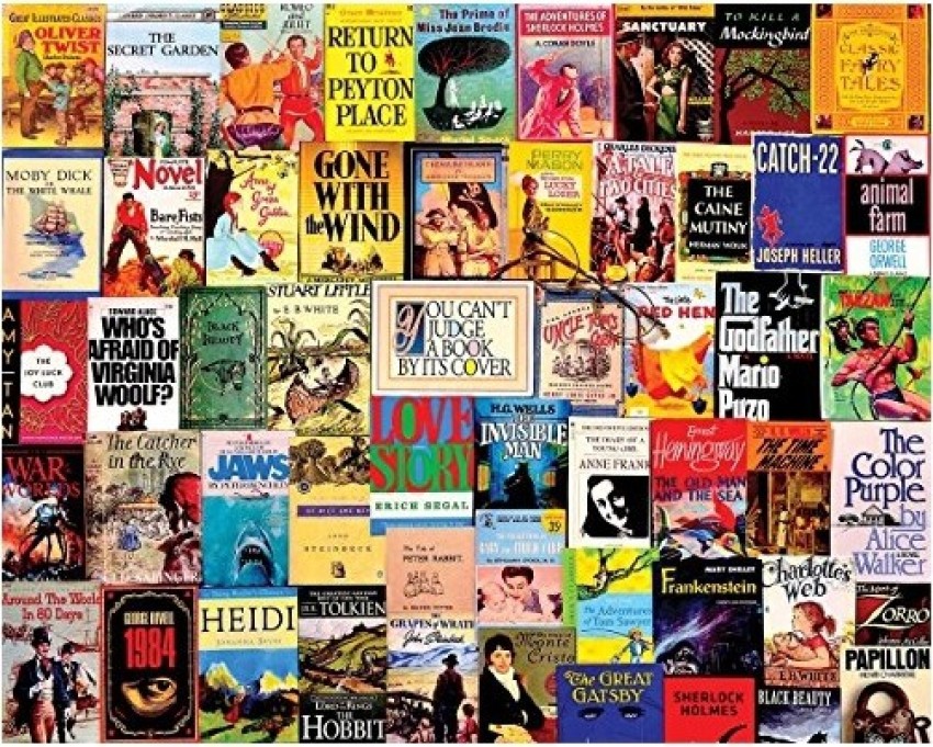
Judging a Book by its Cover (literally)

How often do you buy a book on the strength of its cover? I’m a sucker for a line-cut image of the countryside, it will draw me to a book, not quite despite its content, but it might come close. On the other hand, give me a pink, chick-lit style cover and I will assume the book isn’t for me.
My book club get our books from the library, usually from a list we submit, but sometimes if none of these are available, then from their recommendations. If the book I receive looks unappealing, not to my taste, the opening chapter is going to have to be really good because it’s starting with a massive disadvantage. Like starting a 100m race 20m behind the blocks.
I’ve been researching the market recently, checking out what’s new in my area of writing and searching for up-to-date comps. The comparison titles that agents and publishers so love. They show that you know where your story would be positioned, they act as a shorthand for someone reading your pitch – they know what to expect.
But choosing the right comps can be a tricky task. They need to be relevant, recent, known but not so widely known that anyone could claim them whether they know the sector or not. No matter how many wizards there are in your story, don’t compare it to Harry Potter! And much as a good bookshop browse can eliminate many options, others need to be read. Carefully read. I’ve been caught out before, rushing to choose a comp on the basis of the blurb and first couple of chapters, only to discover that it takes a very different turn midway through the story.
But can I rule out a possible comp on the basis of its cover?
A book cover is designed to represent the contents of the book; to attract the sort of people who would enjoy the text itself. It’s a shorthand, a clue to the book, in the same way as comps are. In fact, covers often include comparison titles, or quotes from the authors of similar books.
But I write YA stories, and to be honest YA books rarely have covers that appeal to me. Why should they? I’m not the target audience. I could imagine a designer producing a pink, diary-style cover for one of my stories, and I could see it working as a calling-card for that book, even though I would never pick up a book like that myself (and I do like YA books, even the ones I write!).
So maybe I need to be a bit more open-minded about the books I browse, less dismissive of the primary-coloured covers I usually avoid. Which means I will have to spend even longer in the bookshop.
Not all bad then!
We know the inside matters more. The inside of a book, the inside of a person. Those of us who self-publish take care to produce a cover that entices and is a fair representation of the book itself.
What about ourselves? Does the way we dress, the care we take over our appearance, the way we walk and talk and greet people, are those things a fair representation of who we are? Of our personality and of our God-trusting, forgiven souls?
Lovely post, Kathryn! Thanks for the post, especially the deep, thought-provoking questions at the end.Blessings.
ReplyDeleteThank you. I'm glad it provoked some thought.
DeleteTo answer your first question: once. I was bored at a Bible week (!), took myself off to the bookshop, and fell for Blue Like Jazz, Donald Miller. The title and the cover did the trick. Fortunately it 'worked' and I've enjoyed other books by Miller since. But, as Sophia, it's the questions at the end that'll keep me pondering off and on during today.
ReplyDeleteThank you John. Some covers just work, don't they? I love it when that leads to a new discovery
DeleteThis is why I think 'Never judge a book by its cover' is weird advice considering all the effort that cover designers go to in order to make the cover completely representative of the book!!
ReplyDeleteInteresting blog thank you.
ReplyDeleteLove the questions, especially the ones at the end. I love making my covers, but maybe wrongly, I make covers I like, as I write stories I like... Maybe that's why my books aren't famous, but I still prefer to be blessed! Thank you for the blog.
ReplyDelete